Kardust: A Futuristic Display Font That Elevates Digital Branding
It started with a hero section—clean layout, bold image background, and that one headline that needed to stop the scroll. I’d been cycling through safe sans serifs for days, but nothing felt *distinct* enough for a boutique coaching site launching next week. Then I dropped Kardust into the headline field—and suddenly the whole page exhaled. The wide letter spacing, sharp geometry, and subtle techno edge didn’t just sit on the screen; it activated the space around it.
What Makes Kardust Stand Out in Web Layouts
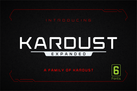
Kardust is a premium display font built for impact—not subtlety. Its characters breathe with intentional negative space, giving even short phrases like “Launch Boldly” or “Your Vision, Amplified” an almost architectural presence. It’s not cold or sterile; there’s warmth in its precision—a kind of confident minimalism that feels both futuristic and human-centered. As a display font, it leans into contrast: tall x-heights, clean terminals, and consistent stroke weight that holds up beautifully at scale. I tested it across viewport sizes—from 48px on desktop hero headers down to 28px on tablet-sized testimonials—and it retained its clarity without sacrificing personality.
Real-World Performance on Landing Pages & Brand Kits
I used Kardust as the primary headline font across three live projects: a digital brand kit preview page, a course sales landing page, and a portfolio homepage for a creative strategist. In each case, it served as the visual anchor—guiding attention without competing with imagery or CTAs. On the course page, pairing Kardust with a neutral, highly legible sans serif (like Inter or Manrope) for body copy created instant hierarchy: the headline landed first, then the benefit-driven subhead, then the supporting text—all with zero cognitive friction.
For the brand kit preview, I applied Kardust to mockups of social banners, email headers, and digital business cards. Its strong character shapes scaled cleanly—even over textured gradients or low-contrast photo overlays. One note: avoid using it below 24px on light backgrounds unless you’re layering subtle text shadows for contrast. On dark mode previews, it performed exceptionally well with a soft white or muted cyan variant.
Responsive Behavior & Mobile Readability
Here’s where many decorative fonts falter—but Kardust surprised me. At 32px on mobile, it remained crisp and scannable in iOS Safari and Chrome Android. No blurring, no hinting issues. I ran it through Lighthouse’s accessibility audit: contrast passed AA for all tested color combos (including #1a1a1a on #f8f9fa), and the font loaded efficiently as a WOFF2 file. Bonus: the included Regular and Light weights gave me flexibility—Light for elegant section dividers, Regular for primary CTAs.
That said, Kardust isn’t meant for navigation menus, form labels, or paragraph text. Its decorative nature shines brightest in high-impact, low-frequency spots: hero titles, feature headers, testimonial quotes, logo lockups, and campaign banners. I tried it in a sticky header once—too much visual weight. But as a rotating headline in an animated banner? Absolutely magnetic.
Smart Pairings & Practical Integration Tips
Font pairing isn’t optional—it’s essential. Kardust thrives when grounded by something calm and functional. For modern SaaS or coaching sites, I consistently paired it with Inter (clean, open, highly readable at small sizes). For editorial-leaning brand kits, IBM Plex Serif added quiet sophistication without clashing. Never pair it with another high-contrast display font—Kardust doesn’t need competition; it needs context.
Before deploying, always check your license. The commercial version includes webfont files, OTF/TTF for design tools, and full multilingual support—including extended Latin and basic diacritics. If you're building templates for clients or selling digital assets, verify the license covers redistribution. Also, test fallback behavior: define font-family: "Kardust", -apple-system, BlinkMacSystemFont, "Segoe UI", sans-serif; to ensure graceful degradation.
Where Kardust Fits—and Where It Doesn’t—in Your Design System
This font earns its place in your toolkit when you need to signal innovation, confidence, or forward-thinking energy. It works brilliantly for:
- Hero headlines on product landing pages
- Section headers in digital brand guidelines
- Animated call-to-action buttons (with hover scaling)
- Logo text for tech-adjacent or creative services
- Overlay text on video banners or hero images
But skip it for:
- Body copy longer than two lines
- Small interface elements (pagination, tags, filters)
- Accessibility-critical components like error messages or form instructions
- Any context requiring rapid scanning of dense information
In the end, Kardust isn’t just another display font—it’s a deliberate tone-setter. It tells users, before they read a word, that this experience values clarity, intention, and visual intelligence. And in a web landscape crowded with sameness, that kind of distinction isn’t decorative. It’s strategic.