Doomberg: A Display Font That Adds Personality Without Sacrificing Clarity
It was 3 p.m. on a Tuesday, and I was tweaking the hero section of a new landing page for a creative coaching practice—minimal layout, warm neutral palette, strong visual hierarchy. The headline needed to land like a quiet confidence: not loud, not flashy, but unmistakably human. I dropped in Doomberg. Instantly, the tone shifted—not dramatically, but meaningfully. It felt like swapping a stiff blazer for a well-cut, slightly asymmetrical linen shirt: professional, yes, but also approachable, intentional, alive.
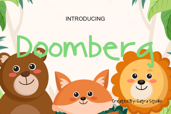
Doomberg is a display font with character. It’s cool without trying too hard, informal without slipping into casual, and asymmetrical in just the right places—like a subtle tilt in the capital “D”, or the uneven baseline rhythm that gives it gentle motion. It’s not a script font, nor a geometric sans; it sits comfortably in that expressive middle ground where personality meets precision. As a web designer, I reach for Doomberg when I need a headline to carry voice—not just information—but do it cleanly, at scale, across devices.
I tested it across real scenarios: over a softly blurred background image (it held up beautifully with generous letter spacing and light tracking), as a section header above body text set in Inter (a crisp, open sans serif), and even as a bold CTA button label on a dark mode variant. In every case, Doomberg delivered visual interest without demanding attention. That’s rare. Many display fonts shout. Doomberg invites.
Where does it shine? Hero titles, absolutely—especially on portfolio sites, course sales pages, and boutique online stores where brand warmth matters. I used it for a small business’s “What You’ll Learn” section heading on a digital course page, and it subtly reinforced the idea that this wasn’t corporate training—it was thoughtful, human-led learning. On a blog redesign, I applied Doomberg only to post titles (not navigation or metadata), keeping everything else typographically grounded. That restraint made each headline feel like a curated moment—not decoration, but emphasis with intention.
Readability is where many expressive display fonts falter. Not Doomberg—at least, not if you use it thoughtfully. At 48px and above on desktop, it’s highly legible. On mobile, I bumped it to 36px minimum with added line-height and tightened tracking. It performs best on light or mid-tone backgrounds; over very dark or complex imagery, I added a subtle semi-transparent overlay or a soft text shadow to ensure contrast. No surprises there—but what surprised me was how well it scaled down to 28px for secondary headings on tablet layouts. It retained its charm without becoming muddy.
That said, Doomberg isn’t built for paragraphs. Nor should it be. It’s a display font—designed for impact, not endurance. I paired it consistently with clean, highly readable sans serifs (Inter, Manrope, and occasionally a warm, low-contrast serif like Cormorant Garamond for editorial-leaning projects). The contrast works: Doomberg brings voice, the companion font brings breath. For logo text or short branded accents—yes, absolutely. For buttons? Only short ones (“Start Free”, “Join Now”) where space allows generous padding and clear visual weight. Never for form labels, error messages, or navigation menus.
Before dropping it into production, I checked the practicalities. Doomberg comes in one robust weight with built-in alternates—some characters have optional glyphs you can access via OpenType features, which is handy for avoiding repetition in repeated headlines. It’s available as WOFF2 for fast web loading, includes basic Latin multilingual support (covers English, Spanish, French, German, Portuguese), and ships with a commercial license suitable for client websites, SaaS dashboards, and digital brand kits. No hidden fees, no subscription—just a one-time license that covers unlimited projects. That simplicity matters when you’re juggling five client builds at once.
I also appreciated how Doomberg plays in responsive design systems. Because its asymmetry is subtle—not chaotic—it doesn’t break at odd breakpoints. No awkward kerning collapses or unexpected ligature clashes on resize. And since it’s not overly condensed or extended, it flows naturally into grid-based layouts, whether you’re using CSS Grid or a lightweight utility framework. I even tried it in a sticky header on scroll (with reduced size and opacity) and it kept its integrity—no jagged edges, no rendering hiccups in Chrome or Safari.
What about trust and professionalism? This is where Doomberg quietly excels. Too many “fun” fonts undermine credibility—think bubbly rounded letters on a financial advisor’s site. Doomberg avoids that trap. Its irregularities feel considered, not careless. There’s craft in its imbalance. That signals authenticity to users—especially creatives, coaches, and independent makers who want their digital presence to reflect thoughtful individuality, not generic polish.
In practice, here’s how I use it across common projects:
- Portfolio homepage: Hero headline + project category tags (e.g., “Branding”, “Web Design”)
- Boutique online store: Banner headlines, limited-edition collection titles, “New Arrivals” badge
- Coaching website: Section headers like “How It Works” or “Your Journey Starts Here”
- Course sales page: Module titles and key benefit statements (“Real Projects. Real Feedback.”)
- Digital brand kit: As the primary display typeface alongside a neutral sans for UI components and documentation
One final note: Doomberg doesn’t replace typographic discipline—it rewards it. Use it where you’ve already established strong spacing, contrast, and hierarchy. Let it elevate what’s already working. Don’t lean on it to fix weak layout choices. Paired with care, licensed correctly, and applied with intention, Doomberg becomes more than a font. It becomes part of the tone, the texture, the quiet confidence your audience feels before they even read the first sentence.